Located on Rua Oscar Freire, in Jardins – São Paulo, the 180 m² apartment underwent a complete renovation at the hands of architect Marcelo Macedo, who runs Studio MEMM. The objective was to adapt the segmented spaces of the seventies building to the client’s demands. With a new layout, the environments gained more amplitude, more intelligent flows and rooms more suited to the lifestyle of the owners.
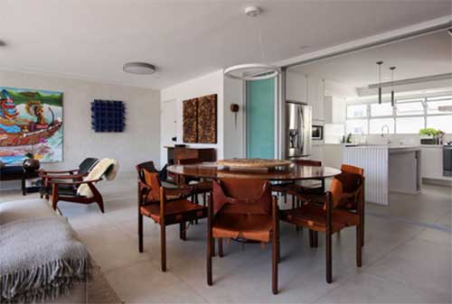
One of the highlights of the architecture project is its connection with Art and Design. Clients already had a collection of works of art and design pieces and wanted minimalist and monochrome environments. With that in mind, Studio MEMM proposed an architecture that would work as a platform for the appreciation of the arts. The built elements should value the collection, creating an environment where a smooth architecture integrates the composition of the whole.
The solution for the renovation was based on punctually inserting well-defined geometries in slatted wood that would balance the gray tone of the masonry, floors and furniture, bringing warmth to the environment. With the strategic positioning of the architectural elements, the voids were calculated to receive canvases and objects, creating a harmonious environment conducive to artistic contemplation.

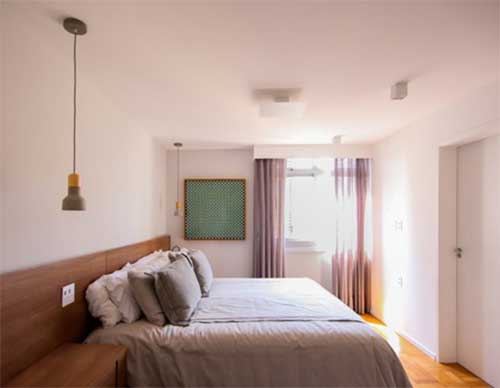
Although the plan was functional, the spatial decisions were linked to the ceiling height, which was restricted, for this reason, the use of ceilings was avoided and the lighting was entirely designed close to the slab, using delicate and discreet pieces, eliminating apparent pipes. that were not part of the proposed aesthetics, the intimate area underwent the biggest change in the couple’s suite and bathroom. Originally located on the side facade of the building, the environment receives less natural light and has little visual opening, due to the neighboring lot. The bathroom, on the inside of the plan, receives only indirect light and loses privacy with the service area. The solution was to replace the master suite with a secondary bedroom which, although smaller, had better lighting and had no close neighbors, as it faced the street. Using leftovers from a wide and old hallway, the bedroom gained a closet and breaking the dividing wall with the bathroom, it became the new master suite, spacious and bright.

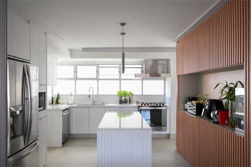
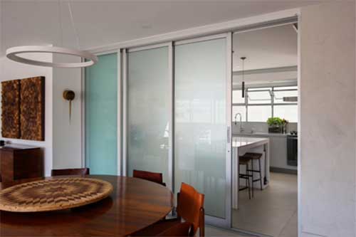
The apartment is even more flexible due to the element present in the door between the kitchen and the living room, which makes it possible to unite the environments, expanding the social space. The kitchen is a bright environment, it has striped windows bringing light, and with the partition open, the integrated room receives light from both facades of the building. In addition, cross-circulation of air becomes possible, ensuring better asepsis and thermal quality.
So that the open kitchen did not become a problem, on the one hand, an attempt was made to relate it to the living room, so that they would form a unique environment, but it was still necessary that they have differences, to avoid that the most critical moments in the service area impact the perception of tidiness and cleanliness in the social area. With a mostly white tone, the kitchen, although close, stands out from the light gray tone of the room. Afterwards, the slatted element enters the environment, but on the countertop it becomes white, bringing the elegance of the room, subtly highlighting the change in use.

With the original frame preserved, the chromatic palette of the project was emphasized, in addition to maintaining the memory of the 1975 building. The handles with a specific design and of the time activate the upper flags maintaining the cross circulation. The decision represented great savings in the financial projection of the work and gave strength to the large partition between the main room and the kitchen to follow the same language in matte aluminum and translucent glass, ensuring that the architecture built the environment for the arts to enchant.
The translucent glass of the sliding door, if necessary, guarantees complete isolation between environments, bringing visual privacy when necessary. However, the slatted wood in the kitchen, brings refinement of the social space into this area, suggesting that it stays open longer.

The apartment also had a staff room, which was located in the central area of the plant with indirect light. With no intention of use, it was replaced, opening up the space and turning into an intimate room that connects the bedroom area with the service area, without having to move to the social area, giving more flexibility to use the house.
A new 0.75x75x1.75 cm saltwater aquarium divides the hallway from the family room, providing filtered lighting as you pass through to the bedrooms and a relaxing way to get in and out of the rooms each day. To ensure that the slab could withstand the high load per square meter under the water tank, the structural design was necessary.
SUPPLIERS:
Lighting: Future Lighting
Woodwork: Ortiz Joinery and Design
Constructions: Torino Architecture and Engineering
Pictures: Cranio Artes and Jean Araujo
Armchairs: Charles Hauner and Martin Eisler
DATASHEET
- Project: MZ2
- Architecture: Responsible: Marcelo Macedo
- Collaboration: Mariana Magalhães and Anderson Toda
- Management/Coordination: Studio MEMM
- Local: Gardens – São Paulo – SP
- Also: 2022
- Area: 180m²
- photo credit: Marcelo Macedo
- Aquarium Structure: Base Engineering
- Aquarium design and execution: Dream Fish
- aluminum doors: Esquadrimax
- Production: Drielly Nunes
About Marcelo Macedo
Marcelo, since the beginning of his training in architecture and urbanism in 2005, realized the possibility of the transformation that the discipline could cause in space, society and the world. In a long stage of preparation, he accumulated academic and professional knowledge until the period in which he decided to put into practice his search for transformations, through Studio MEMM.
He graduated from FAU-Mackenzie, recognized for its emphasis on design techniques, and complemented his studies at the French school, ENSA-Paris-Val-de-Seine, exploring the artistic side of the former School of Fine Arts, taking advantage of the period to also visit the continent .
Graduated, he worked in Brazil for approximately 3 years at Metro Arquitetos doing cultural, educational, residential and urban projects. In the firm’s partnerships, he collaborated with Paulo Mendes da Rocha and OMA.
In 2016, he graduated from the Master of Advanced Architecture at Columbia University in New York, expanding his conceptual knowledge, design techniques and fabrications. She also worked at TPG Architecture in the same city, in the Retail and Corporate Interiors area, when she approached the user scale.
In 2018, back in Brazil, he starts Studio MEMM to use his ideas and beliefs on how to impact architecture and the space in which we live. After the pandemic with the Studio’s structuring and consolidation, Marcelo divides the Studio’s production into his professional work and projects for society. Still, seeking to generate architectural records through books and podcasts seeking to influence the future of the discipline.


